Historical Data Extration from the Zanzibar Gazette (1909)
Introduction
Written and researched by Ahmad Hafizh and Lucas Lin.
1. Project Background
1.1 Source Material
For this assignment, we analyzed the Zanzibar Gazette Year 1909. This specific year was chosen due to its high-quality metadata (text-searchable content), visual clarity, and the overall tidiness of its layout compared to earlier issues. We deliberately avoided the years 1914–1918 due to expected publication gaps or inconsistencies caused by World War I.
Within this collection, we explored several tables, including mail schedules, meteorological data, customs reports, principal item exports, and ship sailings. Among these, the Shipping Reports caught our attention for two main reasons: A. They featured a relatively consistent layout and clear quality, making them easier for us—and presumably for machines—to process. B. Their ease of transcription allowed us to focus on automating the data extraction process and to invest more time in in-depth analysis and visualization.
2 Competition Between Machines
One cornerstone that Klein emphasizes is the idea that ‘the bigger AI model does not mean it is better.’ Their research suggests that simply increasing the volume of data, model complexity, or computational power does not always lead to more accurate AI outputs. For humanities researchers, this insight highlights the limitations of pursuing a single, all-encompassing form of artificial intelligence—revealing the complexity and potential shortcomings of such an approach.
Initially, we used the free version of ChatGPT-4 as our primary tool for text recognition. However, we quickly encountered limitations in processing capacity, managing only around five prompts and twenty rows of data. To address this, we shifted to using Google’s Gemini and DeepSeek which provided broader capabilities for our needs.
We began by using the following prompt for Google Gemini:
“Please generate me a table and .csv file for the image shown here.”
This prompt allows us to gain two things from the generated outcome. First, by displaying the .csv in a table, we can immediately see the result that the AI has generated. This display is important as it will provide us with a quick spot if the AI missed or falsely recognized the text. Second, the .csv file helps us import the data into Google Sheets. We also compared both DeepSeek and Gemini results to see whether they would generate different results. In later parts of our article, we will discuss the pros and cons of both tools.
2.1 Observations:
After working on our assignment using both Google’s Gemini and DeepSeek, we noted the following:
A. Gemini
- The tool lacks support for reading .csv files. Since our project heavily relied on this format, this limitation significantly impacted our workflow.
- When performing OCR, Gemini does not apply self-correction. It returns exactly what it reads—even when the output contains errors. As a result, inaccuracies are likely to persist unless manually fixed.
B. DeepSeek
- In contrast, DeepSeek performs data cleanup. For example, it intelligently interprets ditto marks in tables and fills in repeated values based on preceding rows. We’ll showcase several examples of this cleanup later.
- Additionally, DeepSeek can read .csv files , which allowed it to reference our existing data structure. This feature proved especially useful, as new OCR outputs could be seamlessly merged with our dataset.
🏆 Winner: DeepSeek takes the crown, as it was able to perform key tasks and deliver results that directly supported our research. It may have been trained on similar datasets, enabling it to recognize and interpret our content more accurately than Gemini. Furthermore, DeepSeek provided unique insights based on our tables—something that would have required significant time and manual effort had we done it row by row.
3. Data Processing Workflow
3.1 Initial OCR with Gemini
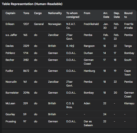
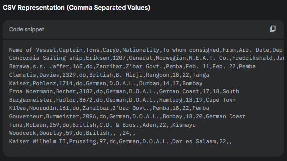
The following is a detailed explanation of our processes. We extracted shipping data from the Zanzibar Gazette (1909) by first screenshotting each page and then feeding these images into Google Gemini. Next are the prompts (bold texts) with their respective results that Gemini gave us. Then, we exported this .csv data into Google Sheets and created a table by splitting columns. From there, we manually cleaned and adjusted certain headers and entries we deemed important.
Hello! Can you please generate me a table and .csv based on the image shown? Absolutely! Let’s break down the information in the image and create a table and a CSV representation.
 |
 |
3.2 Key Adjustments to Raw Data:
There are several changes that we made before visualizing our data:
I. Changing “Cargo Type” to “Ship Type”: We observed that ships could be broadly classified into two categories: a cargo ship and a warship (Man-O’-War). Since “Cargo Type”, we deem, is unnecessary for our research and would not provide beneficial information. Instead, knowing what type came during a specific week of the month (that is, cargo ships or warships) makes our data much more interesting.
II. Replacing “Still in Harbour”: During our review, we frequently encountered the phrase Still in harbour , typically appearing in the Bound To column. We interpreted this phrase signifies that the ship has yet to depart from its current harbor. To avoid ambiguity and enhance the accuracy of our visualizations, we replaced this phrase with the ship’s original harbor name. This ensured that the data would still plot correctly on the map—even when the vessel had not moved—preventing missing or broken lines in our final output.
III. Geographic Data Verification: The geocoding stage revealed several geographic inconsistencies that required custom solutions:
- Unrecognizable names like German Coast were replaced with their modern equivalents (e.g., Germany), following archival research.
- Directional terms (e.g., South) were interpreted in context—typically mapped to South Africa when no specific destination was mentioned.
- Spelling variations (e.g., Daressalaam vs Dar es Salaam) were standardized using a master reference list.
- Obsolete or ambiguous locations (e.g., Tania, Gaulle ato Dobouti) were researched through colonial-era records to determine their modern equivalents.
IV. Text Recognition and Formatting Corrections: Due to the suboptimal quality of the source images, our team conducted meticulous side-by-side comparisons between the OCR-extracted data and the original newspaper scans. From this process, we compiled a comprehensive list of common error patterns (e.g., “1900” vs “1909”, “Wami” vs “Wani”) to inform consistent and targeted corrections. Company names were also standardized through carefully defined rules addressing spacing (e.g., D.O.A.L. vs D. O. A. L.), capitalization (Co. vs co.), and punctuation for ampersands and abbreviations. Each data point was subject to double verification, with particular attention given to numerical values—often misread by OCR due to the poor image quality—to guarantee the highest level of accuracy.
V. Temporal Data Preparation: Preparing the date data for Kepler visualization required a high level of precision. We implemented a strict standardization process, beginning with the reconstruction of incomplete dates by examining contextual clues from surrounding entries and aligning them with the publication rhythm of the newspaper. Each timestamp was reformatted to include both date and time components, with any missing time values defaulted to 00:00:00. The entire date column was manually processed to enforce a consistent structure—specifically, the “1909-MM-DD 00:00:00” format—ensuring full compatibility with Kepler’s input requirements. Special care was taken to correct OCR-induced date errors while preserving historical accuracy across the dataset.
VI. Ship Prefix Standardization Process: Due to inconsistencies in how ship prefixes were recorded (e.g., S.S. for steamship, C.S. for cable ship), extensive manual corrections were necessary. Prefixes often appeared in the wrong columns, were omitted altogether, or featured irregular spacing and punctuation (e.g., “S .S.”, “S.S .”). We conducted a comprehensive audit of each entry, cross-referencing historical shipping registers to confirm accurate prefix usage. All variations were then standardized to the correct “S.S.” or “C.S.” format, ensuring clarity and consistency throughout the dataset.
🔗 Download: Shipping Records (CSV)
4. Data Correction & Scaling
4.1 A Major Overlook: Incomplete Page Cropping
Three-quarters into the process, a significant oversight came to light when we attempted to visualize our data. We had been taking ‘snippets’ of the shipping reports by cropping only half of the page. However, upon a closer comparison—specifically juxtaposing the 16th March 1909 report with others—we realized that every Zanzibar Gazette shipping report from 1909 spans an entire page.
This discovery revealed that the reports were not limited to cargo ships but also included warships (categorized as Man-O-War) and smaller, traditional vessels (classified as Dhows). Consequently, what was once a visualization focused solely on cargo ships was expanded to encompass a broader range of maritime activity.
With this new insight, we decided to incorporate warships into our primary shipping report table. However, since the Dhows Arrived and Dhows Departed data followed a different structure, we chose not to integrate them into the main table. Instead, we created a separate table and visualized the dhow data using bar graphs.
4.2 Nudging the Tool
After manually processing over a hundred rows, fatigue inevitably set in. Manually editing each entry was no longer feasible. This prompted a new idea:
“What if we feed the machine our edited tabular data and ask them to do OCR and generate the output based on our table structure?”
At this point, we discovered that Gemini does not support .csv files—but fortunately, DeepSeek does. Below is a summary of the prompt sequence we used to generate over 100 rows of structured data with DeepSeek.
| Prompt | Output |
|---|---|
Uploaded 1909_ShippingReport.csv (our base file) “Okay. I have attached a file here. Please examine the file and take note of the headers and the contents stored within.” |
DeepSeek examines the file. Let me know if you’d like to explore specific aspects (e.g., filtering by nationality, time ranges, or missing data)! |
Uploaded a screenshot of the Zanzibar Gazette Shipping Reports 1 June 1909 Now, examine the 1909_ShippingReport.csv file I have provided. If you still remember and examined correctly, you should notice that the tabular data image I have provided you contains data structured similarly to the .csv file I provided. Can you merge the .csv file I just provided with the ones you created? Ignore the longitude (from), latitude (from), longitude (destination), and latitude (destination) columns and leave them empty. |
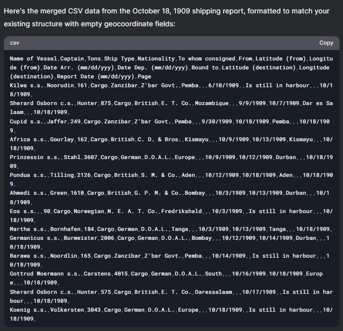 |
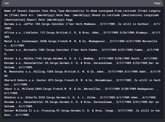
“Remember the steps that you have done previously.” “Here is a new image similar to the ones I gave before. Extract the textual information and adjust the data so that it fits the 1909_ShippingReport.csv structure while ignoring longitude (from), latitude (from), longitude (destination), and latitude (destination) columns and leave them empty.” |
 |
5. Visualization
5.1 Kepler Interactive Map
We created an interactive map by importing our standardized dataset into Kepler, structuring it with three primary visualization layers:
A. Origin Points: Translucent circles mark each departure location—blue for cargo ships and red for warships—plotted using their departure coordinates.
B. Destination Markers: Uniform yellow dots represent the “Bound To” locations.
C. Trajectories: Dynamic arrows connect origin and destination points, color-coded by vessel nationality (British = red, German = green, French = blue, etc.).
 🔗 Download: Kepler.gl Data (JSON)
For clarity, origin labels are styled in blue, and destination tags in yellow. We added a temporal dimension using an animated timeline (set to 2x playback speed), which renders routes sequentially based on rigorously formatted arrival dates (DD-MM-YYYY 00:00:00). This multi-layered visualization communicates three key narratives: (a) geographic movement patterns via the point-to-point connection system, (b) national fleet distributions through chromatic encoding, and (c) historical sequencing via the time-based animation.
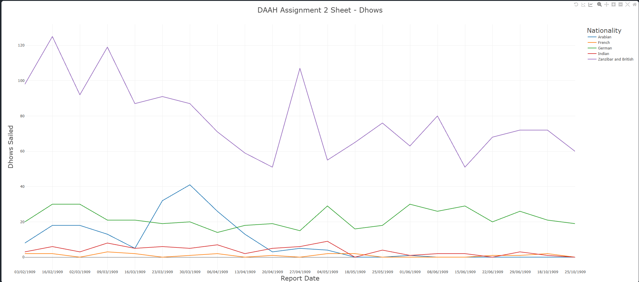
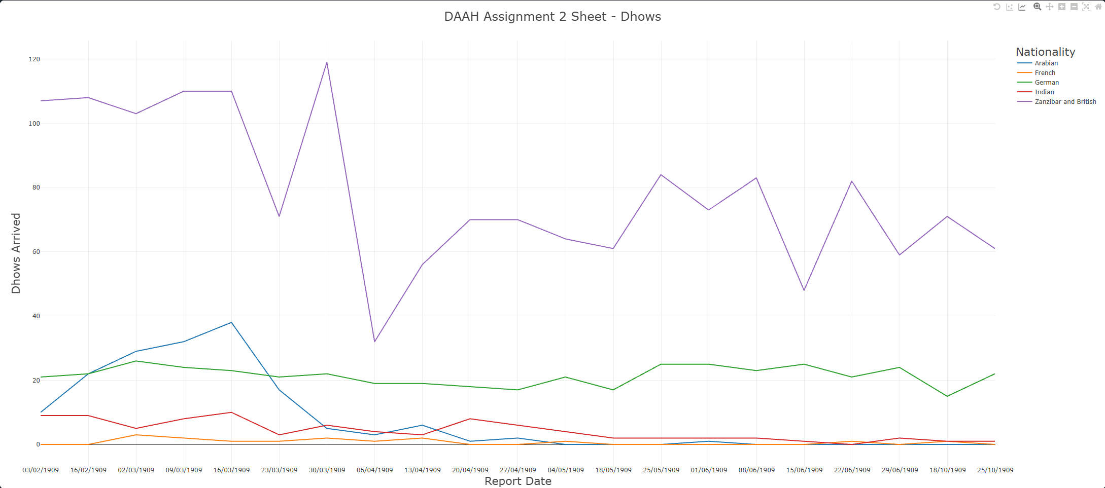
5.2 Fantastic Dhows and Where to Find Them
Initially, we tried using Google Sheets to represent our analysis on Dhows. However, we encountered numerous problems regarding Timeline Graphs, and the outcome did not display the data like we expected. Instead, we used an online tool called CSV Plots to map our data in a line graph.
| Dhows Sailed |
|---|
 |
| Dhows Arrived |
|---|
 |
6. Conclusion
This assignment has allowed us to learn more about AI, specifically its capabilities of doing humanities tasks. On first glance, we did not identify any major conclusions from our data. Rather than not having enough information, it lies at the point that nothing particularly ‘interesting’ surfaced from the shipping records.However, through closer inspection and contextual analysis, we were able to identify meaningful patterns—though these observations remain provisional and would require further research beyond our dataset to confirm. Zanzibar, in 1909, stood as a vital maritime trade hub in East Africa. Although under British colonial rule at the time, it maintained strong commercial ties with Arabian traders, particularly those from Oman. The high number of Zanzibar/British dhows indicates local dominance in maritime activity. We also took into account external influences that might affect the data, such as:
- Seasonal Trade Routes: Maritime trade was heavily influenced by monsoon patterns, particularly between March and May. Dhows from Arabia and India likely followed these seasonal wind cycles—evident in the noticeable drop in arriving dhows during these months.
- Colonial Policies: The dominance of British and Zanzibari dhows may have been shaped by colonial policies that favored local or colonial-affiliated traders, potentially limiting foreign competition.
- German Presence: The presence of German dhows could be linked to the presence of German East Africa at the time, which encompassed modern-day Rwanda, Burundi, mainland Tanzania, and a small section of Mozambique..
- Relative Influence: Arabian and German traders demonstrated moderate activity, while French traders seemed to play a relatively minor role in Zanzibar’s maritime network.
Ultimately, while our project began as a technical exercise in digitization and data visualization, it gradually revealed layers of historical insight—underscoring how even seemingly mundane records can illuminate broader narratives when combined with careful analysis and contextual understanding.
7. Contributions
On this assignment, Ahmad prompted the AI chatbots, created the .csv file in Google Sheets, made the Dhows graph, and wrote the initial documentation. We both refined the Shipping Report table and collaboratively wrote the markdown post. Lucas focused on the technical aspects, including double-checking the main table, visualizing the data in Kepler, creating a GIF, and proofreading.
Resources
Klein, Lauren, et al. “Provocations from the humanities for generative ai research.” arXiv preprint arXiv:2502.19190 (2025). The Editors of Encyclopaedia Britannica. “German East Africa”. Encyclopedia Britannica, 15 Oct. 2024, https://www.britannica.com/place/German-East-Africa.
✅ Ready for grading